Our client was clear: the visit card would be his only and unique presentation. The complexity of this project was a challenge, how to synthesize all the information given by the client in something so small without losing his identity and style.
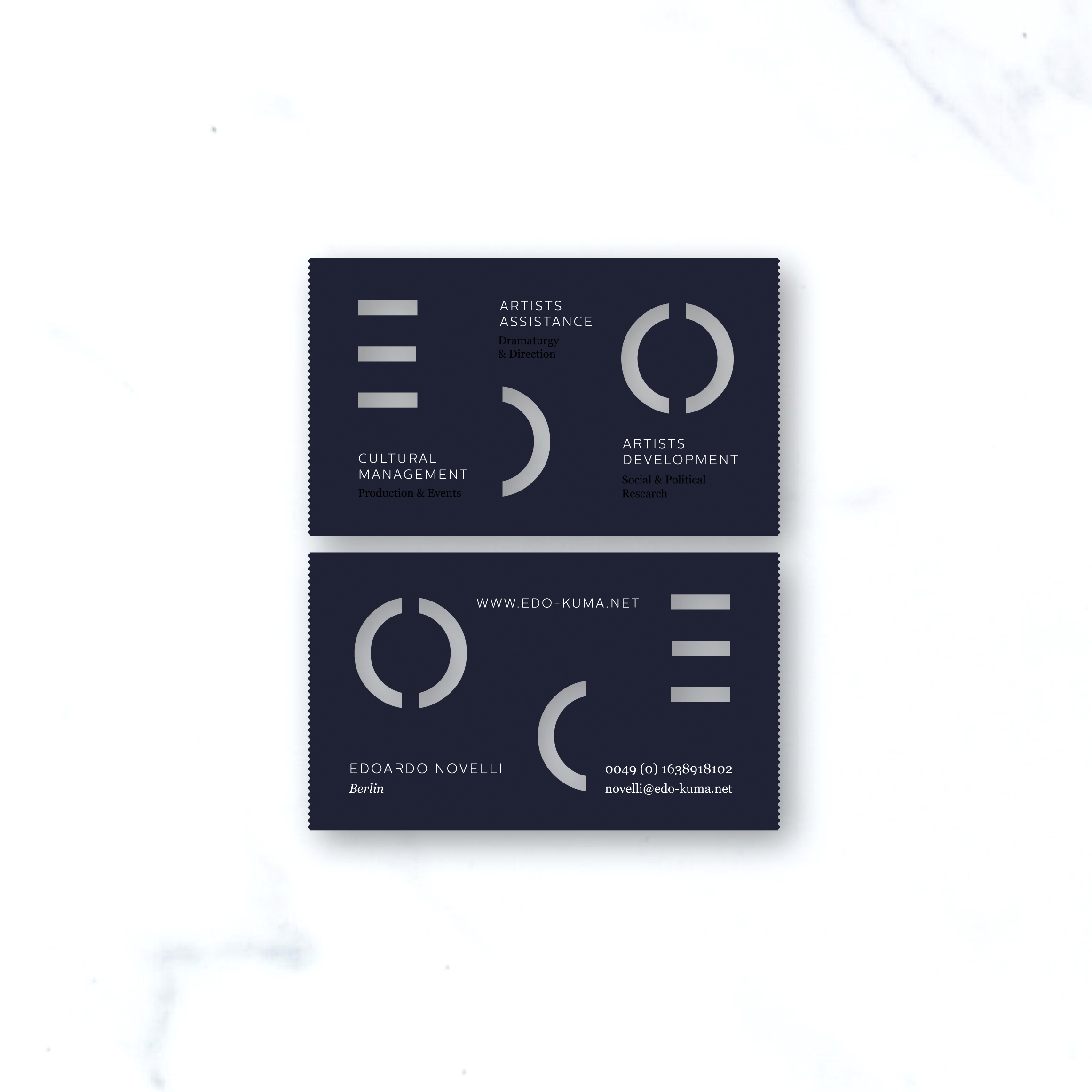
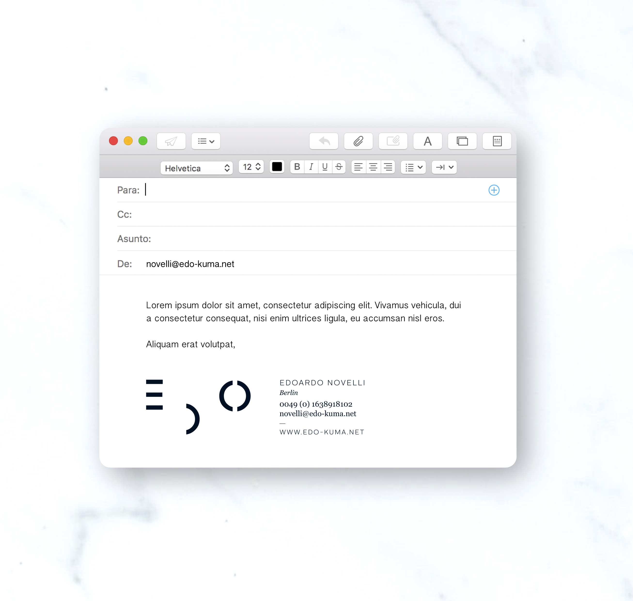
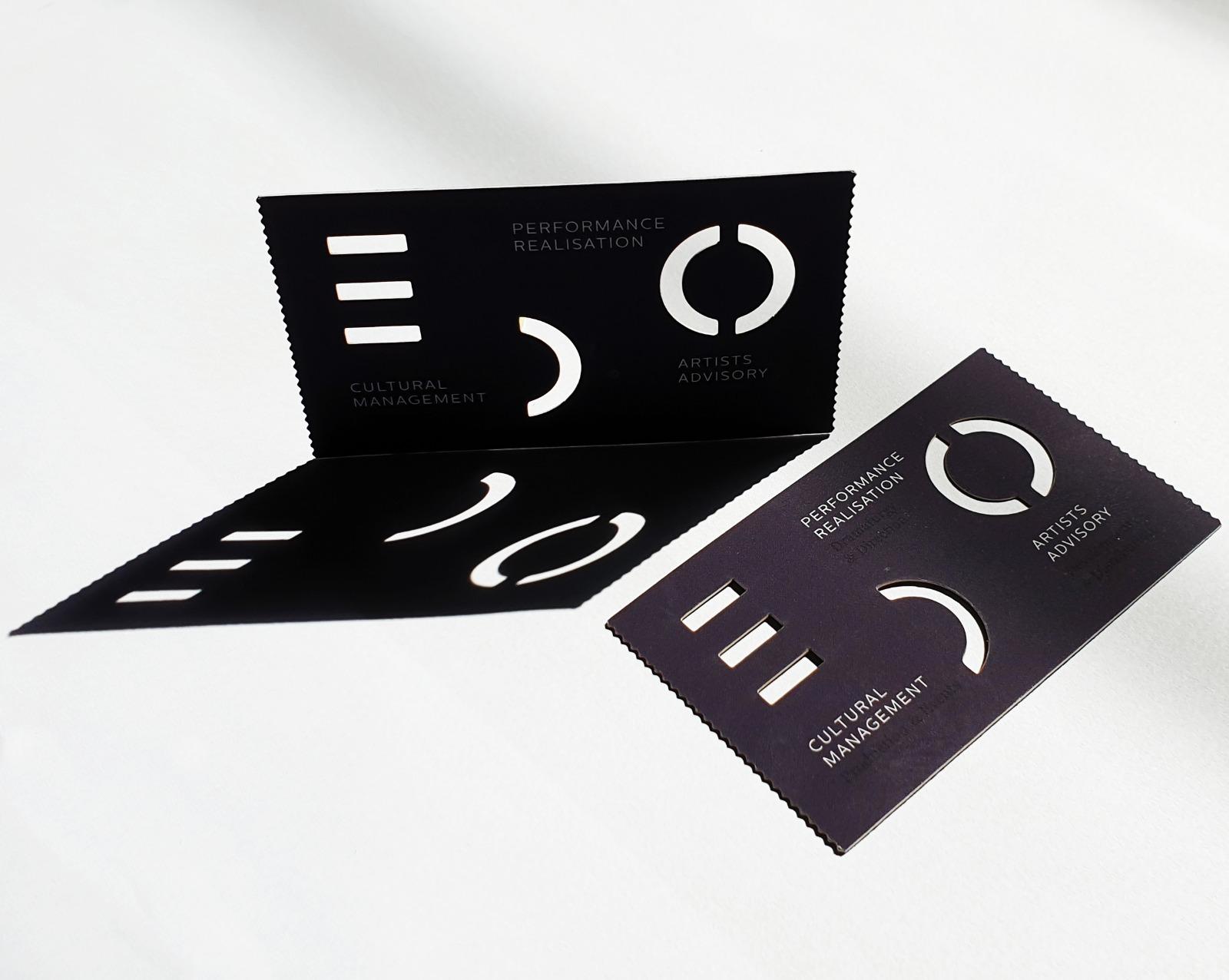
Focused on the world of dance, the card had to show a theatrical character with delicate and powerful lines as if it were a choreography. The first step was to design his logo, his identity sign. Three powerful letters that organize the composition of the card dividing the space into his three areas of expertise.
Also, following different degrees of information, 3 printing techniques have been used, on the one hand, the logo and the ends of the card are die-cut, the most important information is silk-screened with white ink, and finally the third technique of UVI glaze presents hidden data, which with the touch or movement of the card will be appreciated. To emphasize the theatricality of the card, the height has been reduced 5 mm, to create a more elongated format, simulating a “ticket” format. That way, the receiver of the card is invited to a future show that is still to be done together with our client.
Client EDO / Year 2018 / Status Published